Saturday, May 15th, 2010

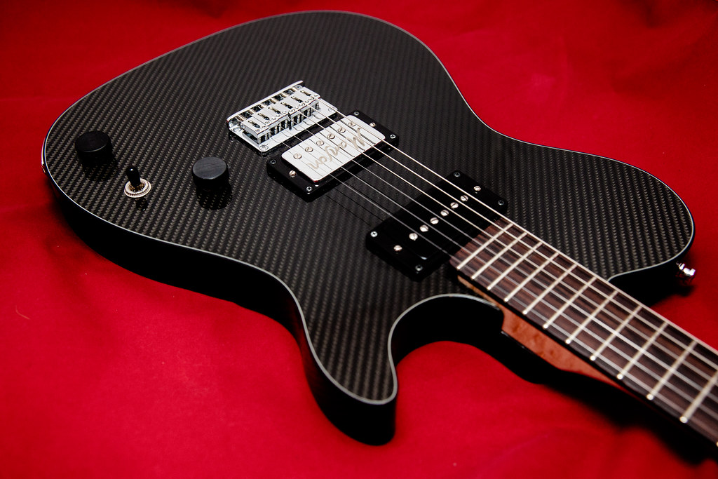
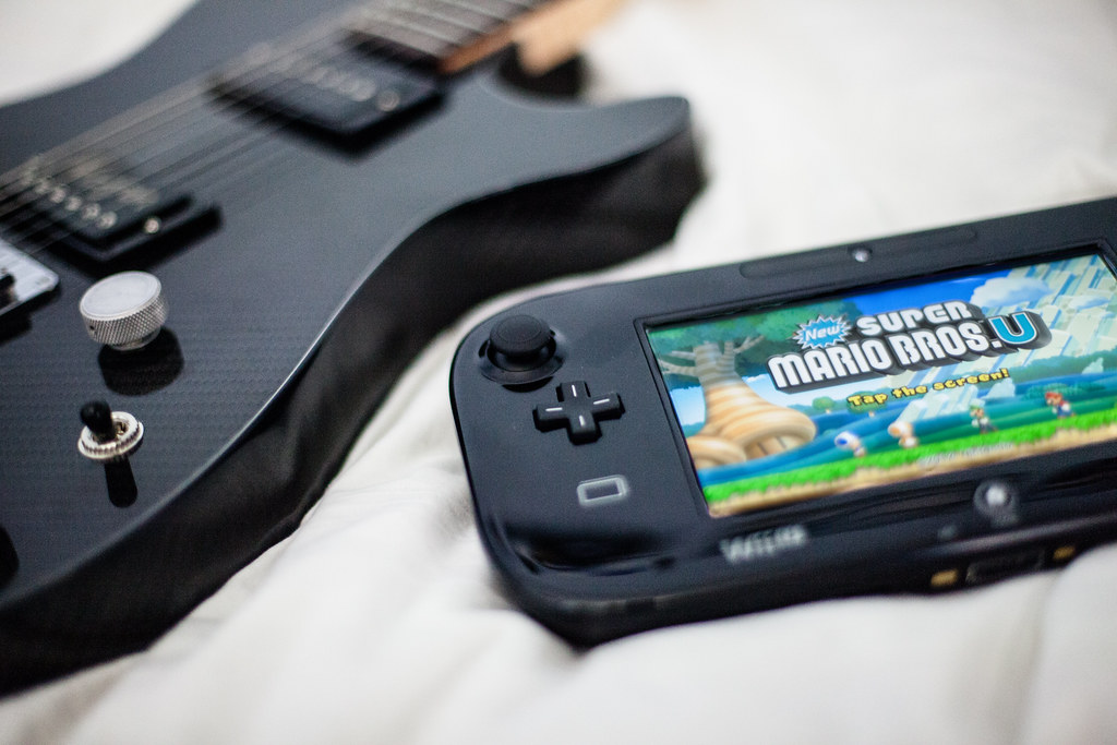
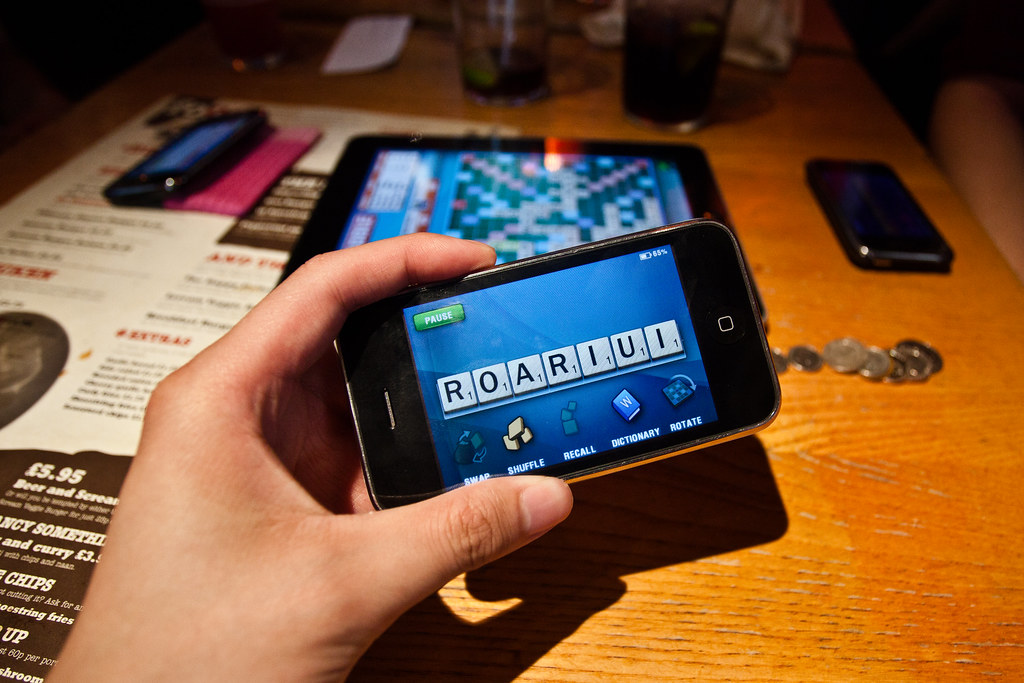
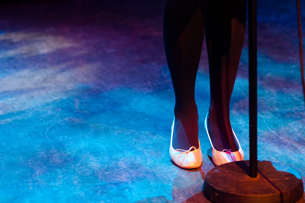
Right so here it is, the new site! I’ve been spending most of my mornings and afternoons coding this bad boy from scratch. Been playing around with jquery to try on some fancy stuff and overall it works pretty well 🙂 The best bit is when you click on the exclamation mark! So yeah, as you can see, images are nice and large so you can enjoy the photos more! Being a site quite focused on photography it kinda makes sense to have large images. So yeah, enjoy some large unadultered images to further explain why the site redesign was needed
(more…)
">Google Bookmarks,
">del.icio.us,
Friday, May 14th, 2010

Here’s a little sneak preview of what the new site is going to look like. I’ve been spending most of the day trying to tweak the blog into something more tasteful, vibrant and most importantly, incorporating larger images for my photos. So yeah, this is kinda what I was looking for, for those who happen to be browsing the blog tonight may or maynot have actually seen the theme in action (was the easiest way to show friends and folks) but otherwise we’re still using the old one.
The theme was built from scratch and should work on previous posts, older posts will have some pixellated photos but meh! But yeah, let me know what you think.
">Google Bookmarks,
">del.icio.us,
Thursday, May 13th, 2010

Going to build this badboy from scratch again, want a more minimal feel with more photo related scripts and whatnot. I dunno, feel like I should be using more jquery to do something fancy pants! Not to mention do something so that i can show bigger photos, we love big photos!
Oh, reason of posting this… suggestions on what the new blog should look like? things you like and dislike about the design, SPIT IT OUT DAMNIT!
">Google Bookmarks,
">del.icio.us, 